Client: Diageo
Brand / Variant: Loyal 9 Classic Margarita
Year: 2023
Brand / Variant: Loyal 9 Classic Margarita
Year: 2023
Had a lot of fun & freedom with this project! "Classic Margarita" was a brand new flavor for Loyal 9, and we hadn't yet received a style guide on it yet (only for the main variant). My aim was to match the style of the brand's flagship variant "Classic Lemonade" by repurposing imagery from package flats and other existing branded imagery, and then add a green "Margarita & Lime" twist to it.
"Above the Fold" Gallery:
These images are part of the upper gallery of the store page, aiming to inform and sway viewers toward the purchase. Included here are the Alcohol-By-Volume (ABV), an Ingredients image, and an Occasion / Gifting image.
• ABV - This was the winner out of a few variations I'd made, and was to set the tone for the other typography-first frames. The water drops background was recolored from their package flat designs for the classic lemonade flavor, which was also the origins of the cool "halftone pattern as a shadow" motif. Their style guide suggested avoiding anything looking overly-photoshopped, so keeping edges crisp and colors poppin' was key.
• Ingredients - Quick type treament, designed the frame to match the vibe of the ABV frame.
• Occasion - The photo was a stock image, wherein I edited the woman's hand to appear as if she was holding the can. The go-to Occasion image for the brand would have been a beachfront, so they were happy to see a new solution for these!
ABV

Occasion
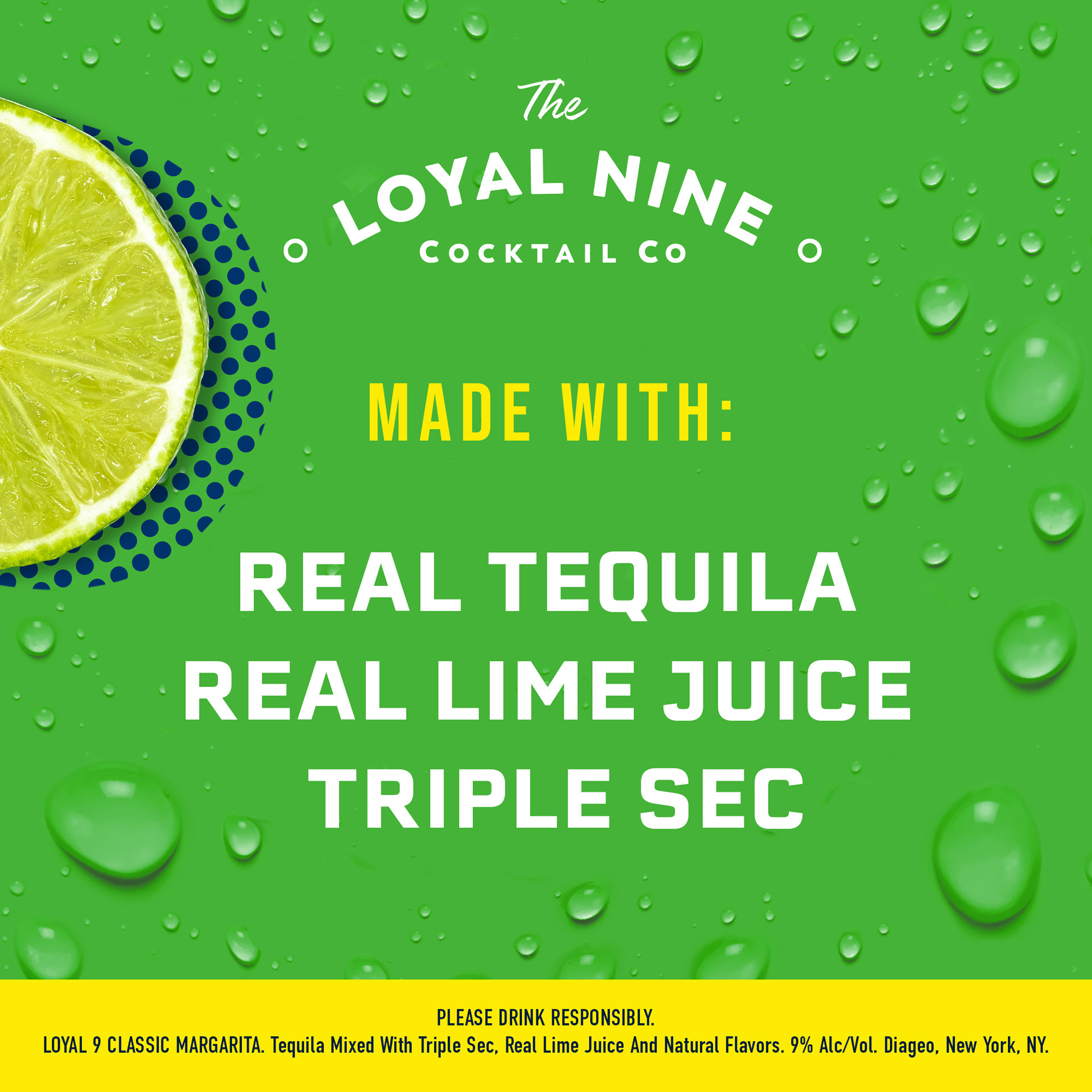
Ingredients
Below the Fold Images:
These images and the mockup below followed after the Above The Fold gallery to further inform the viewer on the brand, it's history, and some nice cocktails to enjoy with it. Everything was designed in Photoshop and Illustrator to match the vibe of the existing branding (as we didn't yet have a style guide for the Margarita flavor variant).
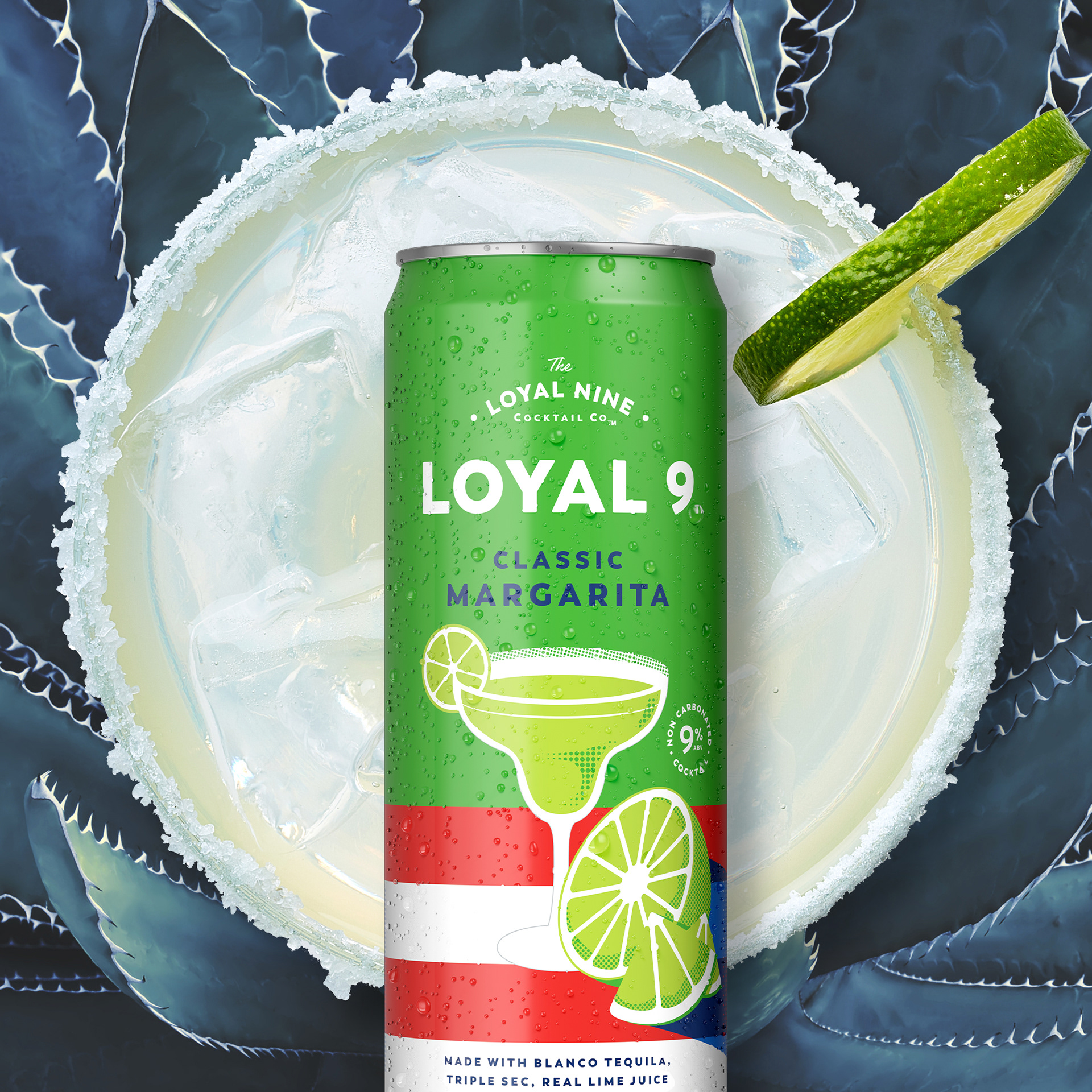
• Hero Banner - This is a composite of 4 images plus a halftone pattern, all put together in photoshop. The margarita and lime are stock photos, put there to help visually describe the flavors within. I wanted a simple background that allowed the LOYAL logo to stick out in a bold way.
• Brand History / Family - This was made from the bottom-up in Photoshop, using the brand's core colors of yellow and dark blue, and adding a cascading rainbow of their assorted flavors in an angle for some movement and fun.
• Less Fizz / More Flavor - Two variations included, more details below
• Less Week / More Weekend - Two variations included, more details below
• Redirect Banner - This was designed to mimic a previous banner they had for the Classic Lemonade flavor, but with a lime / margarita twist to it.

Hero Banner
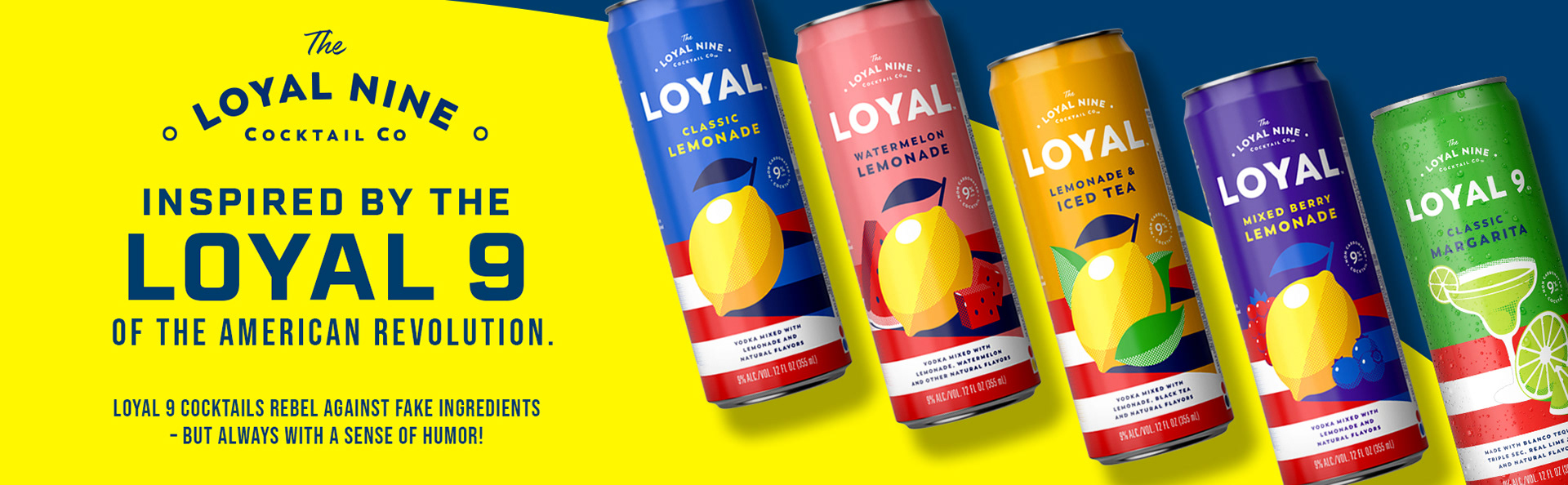
Brand History / Family
"Less Fizz, More Flavor" V1
"Less Week, More Weekend" V2
"Less Week, More Weekend" V1
"Less Fizz, More Flavor" V2
Redirect Banner
Below the Fold - Preview Mockup for Client:
Below is an example of a mockup we would send to our client, to show how the section would appear online. There are two versions below, each with a different visual interpretation of "Less Week, More Weekend" and "Less Fizz, More Flavor":
• LEFT - This was a really fun approach I came up to illustrate the two phrases using some stock images composited together. I loved the idea of keeping a halo-like image behind the can, can changing whatever the halo was, whether a sun, margarita glass, or a lime slice.
• RIGHT - This version was designed to coordinate with other existing branded materials and not stray too far. I'm still happy with this, but personally enjoy the visual excitement more in the first.
V1