Hero Banner
Recipe
Client: Diageo
Brand / Variant: Baileys Vanilla Mint Shake
Year: 2023
Brand / Variant: Baileys Vanilla Mint Shake
Year: 2023
After the success with Lagavulin, I was given a lot of freedom with the Baileys Vanilla Mint Shake project. I dove hard into their style guide and website for research on the new limited-time flavor variant, and collaborated with our copywriters to come up with the direction for the gallery images.
"Above the Fold" Gallery:
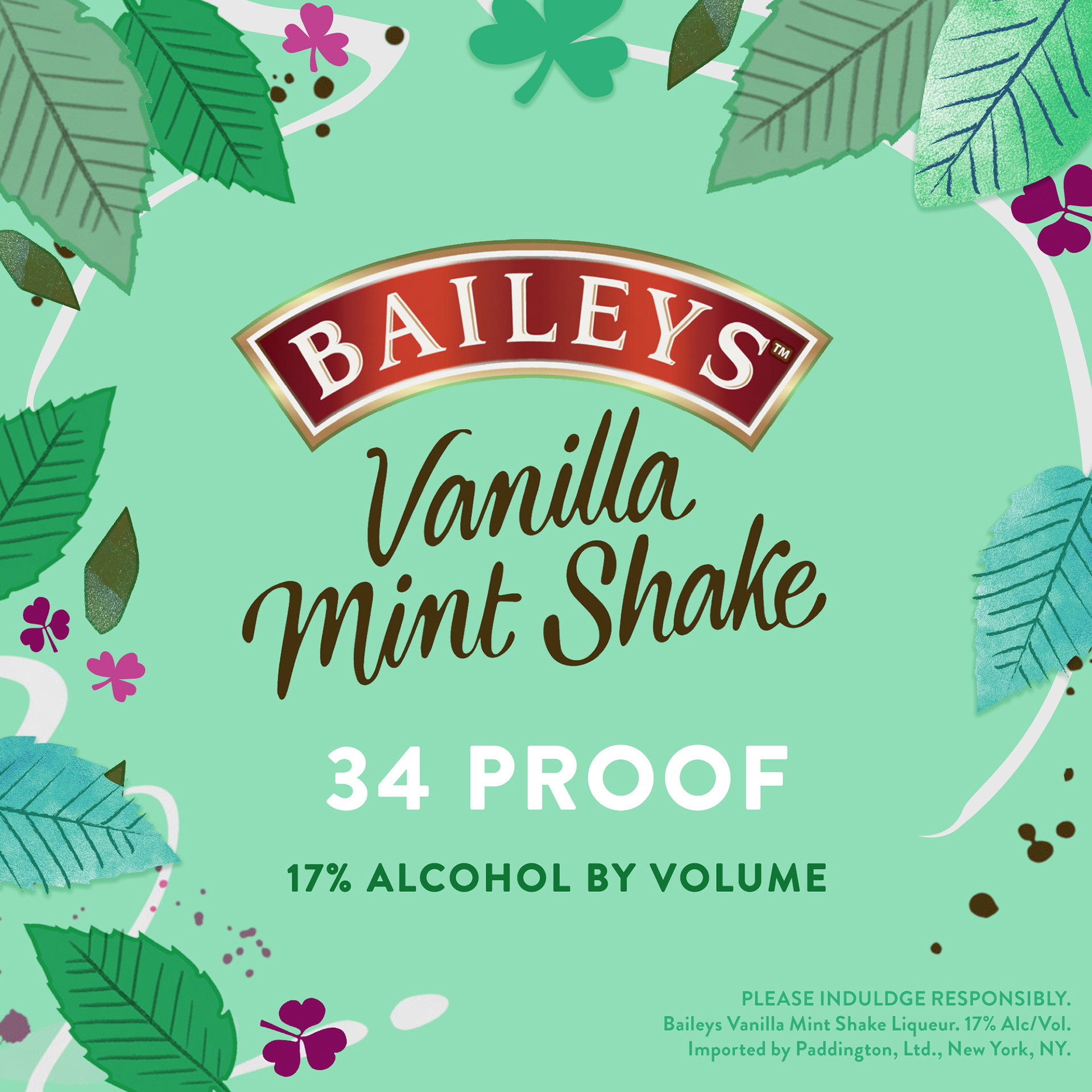
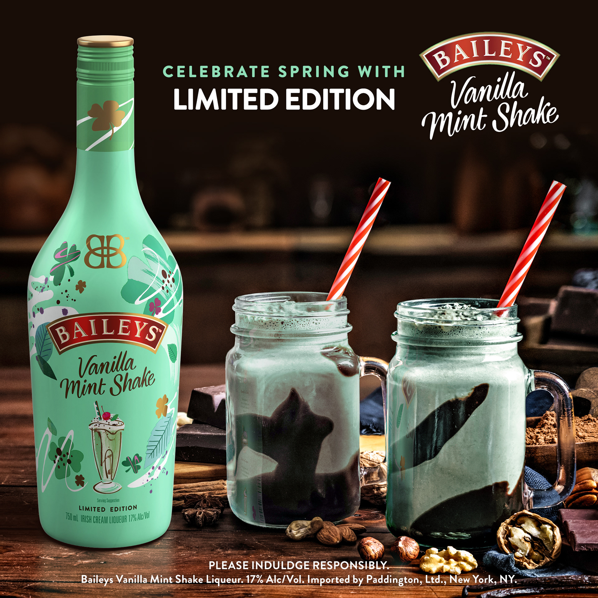
These images are part of the upper gallery of the store page, aiming to inform and sway viewers toward the purchase. Included here are the bottle front image, Alcohol-By-Volume (ABV), Lifestyle, an Ingredients image, and an Occasion / Gifting image, and a Feature Claim image.
"Above the Fold" Gallery:
These images are part of the upper gallery of the store page, aiming to inform and sway viewers toward the purchase. Included here are the bottle front image, Alcohol-By-Volume (ABV), Lifestyle, an Ingredients image, and an Occasion / Gifting image, and a Feature Claim image.
• ABV / Ingredients / Feature Claim - On these frames, I borrowed the mint and clover leaf illustrations from the package flat design to build an ornate border to frame the copy, and to be a theme that ties the frames to the rest of the series. I wanted it to feel organic, light, and have movement, while showing off the important info in its best light.
• Lifestyle - This frame was originally a stock photo. I extended the frame for composition, and added the front bottle (including the shadows and reflection on the table), turned the milkshakes an appropriate mint green color, and added the bottle reflection in the glass of the milkshake.
• Occasion - This too was originally a stock photo, here with the green mug centered. I extended the frame to make room for the bottle front and text, added the bottle and cast shadow, and added a shadow to the side of the bottle to ground it in the scene. Then I designed the text lockup, and added the some of the mint leaf motif to tie it to the other frames.
Please Click the previews below to see them larger:
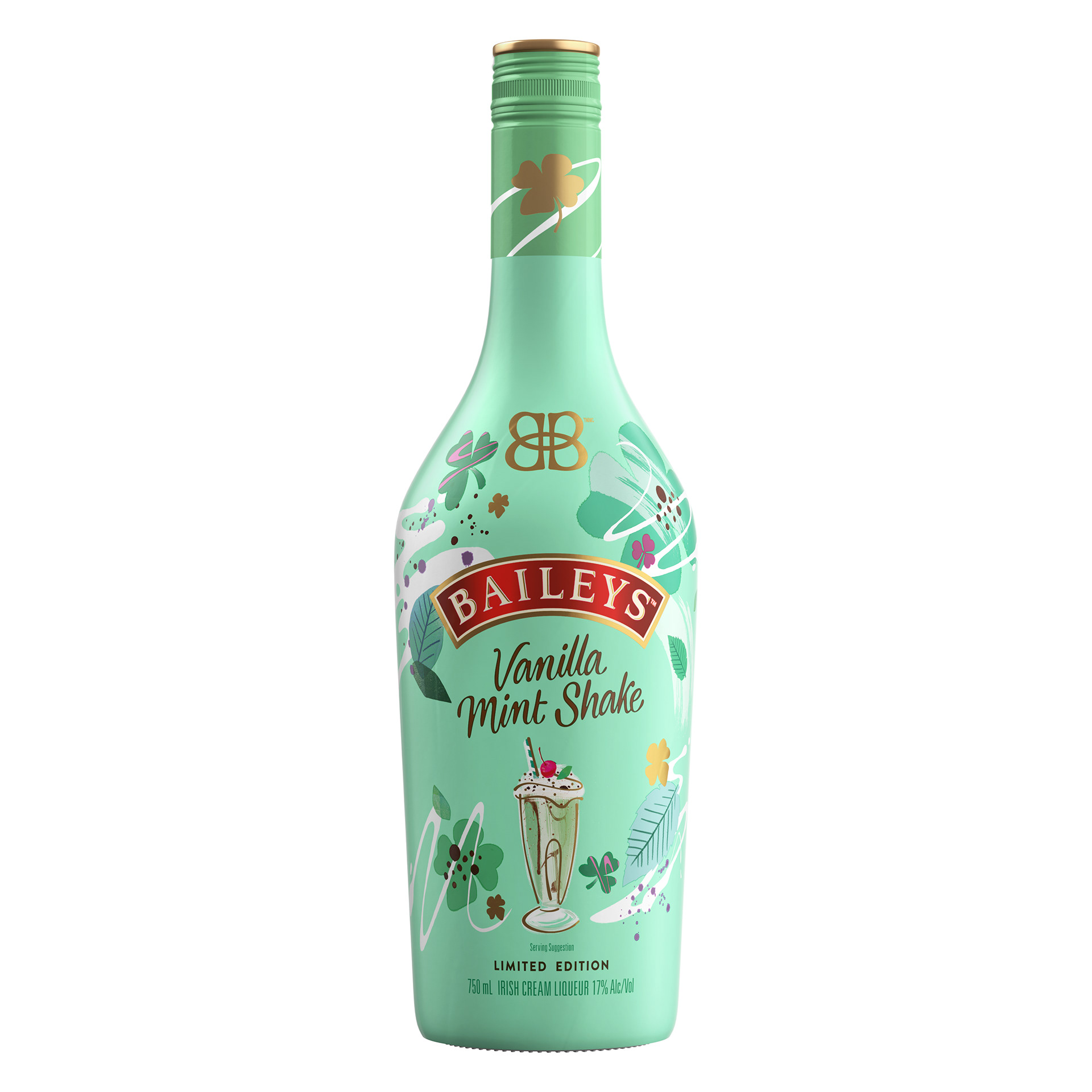
Bottle Front
ABV
Lifestyle
Ingredients
Occasion
Feature Claim
Below the Fold Imagery:
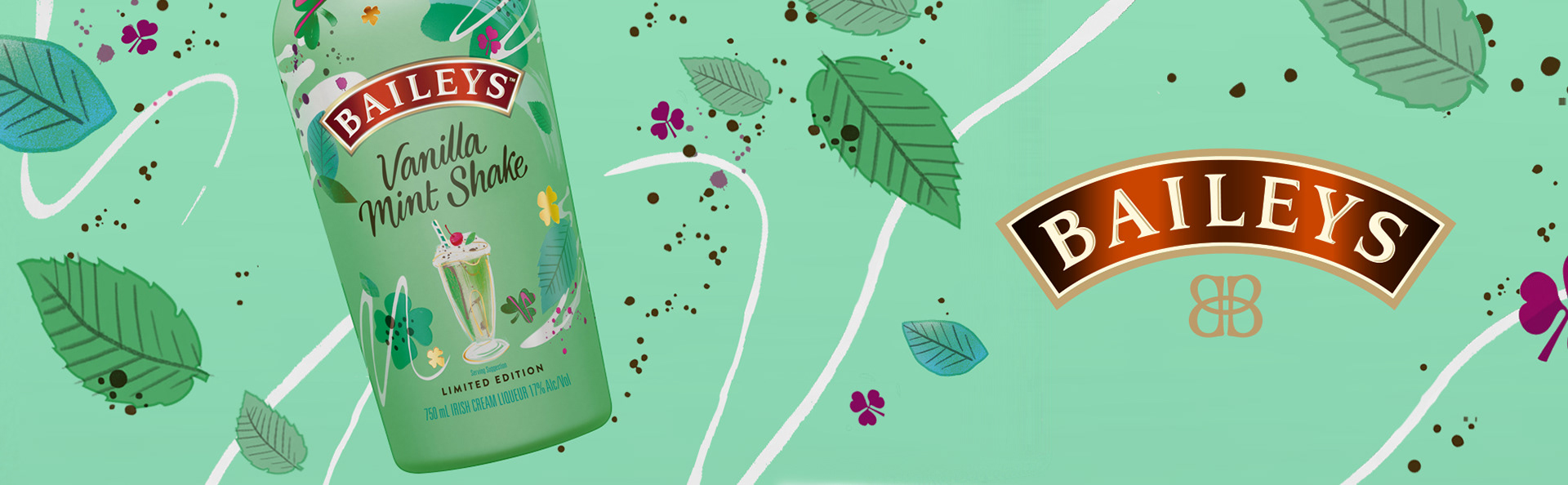
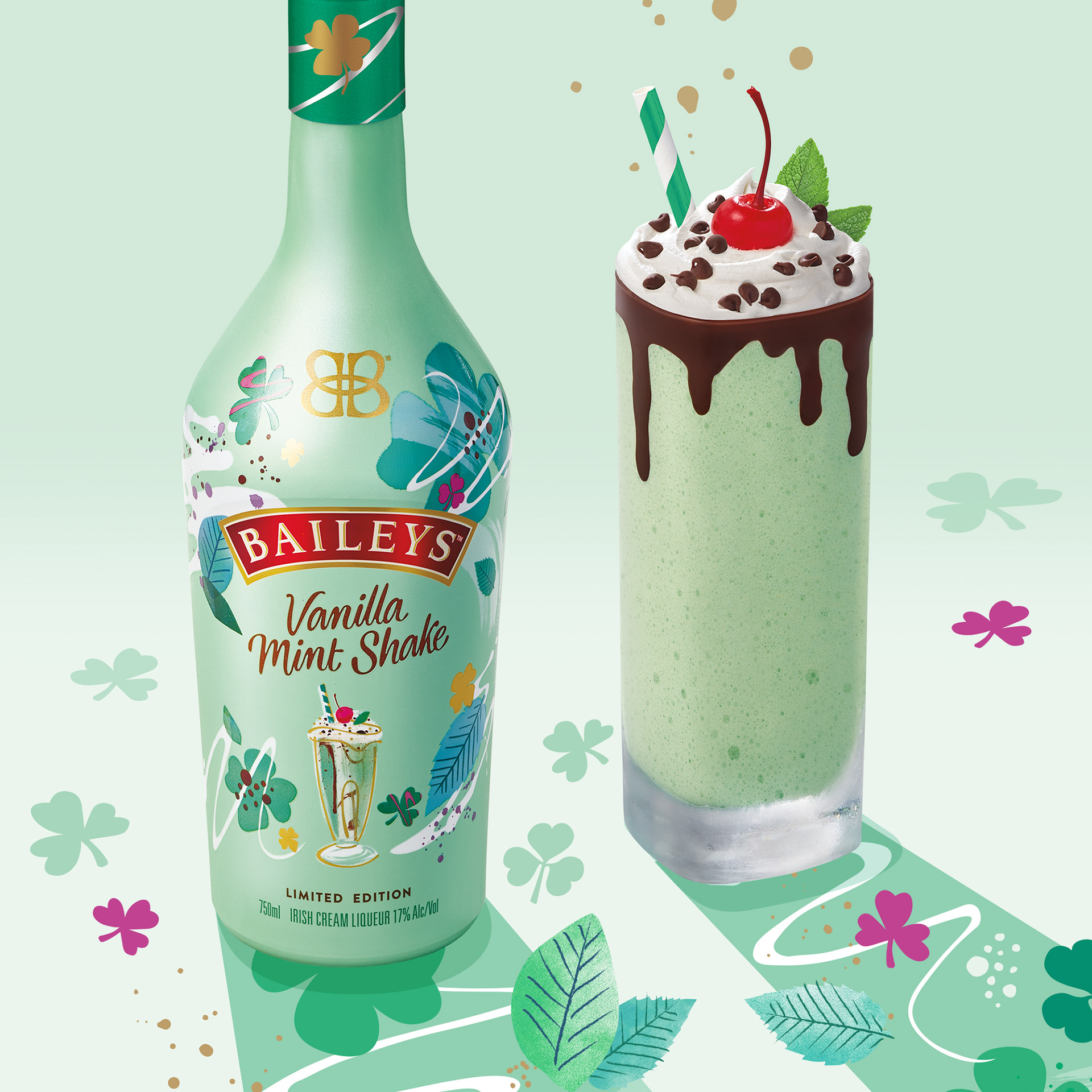
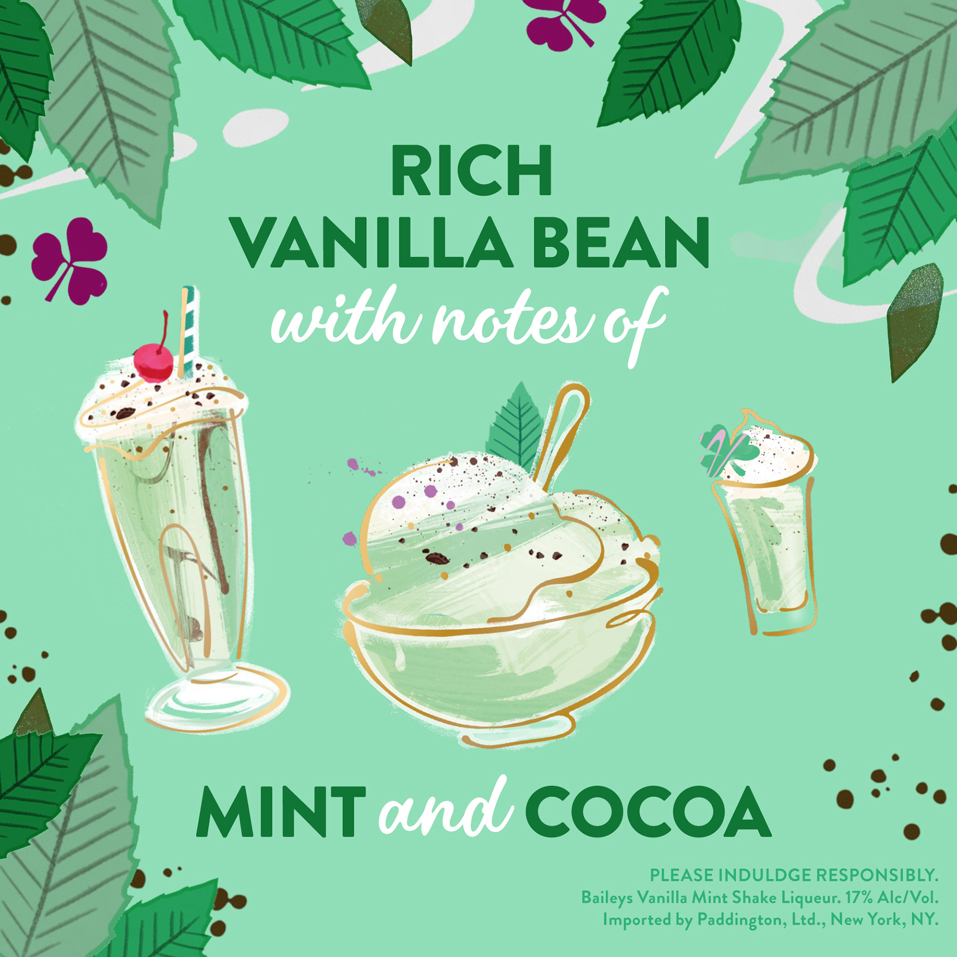
These images and the mockup below followed after the Above The Fold gallery to further inform the viewer on the brand, it's history, and some nice cocktails to enjoy with it. The hero banner (wide green one with leaves, etc) was designed with elements borrowed from the package flats. The milkshake illustration was repurposed and resized from existing creative to fill out the recipe section of the page.
• Hero Banner - This was designed using the elements from their package flats. I wanted to use the vanilla swirl, leaves, and chocolate splatters to playfully give the banner an organic, "floating underwater" movement.
• Recipe - This was originally a vertical illustration provided by the client. I rearranged the placement of the bottle and milkshake for visual interest, and cropped it into a square to fit the format required.
Below the Fold - Preview Mockup for Client:
Below is an example of a mockup we would send to our client, to show how the section would appear online.
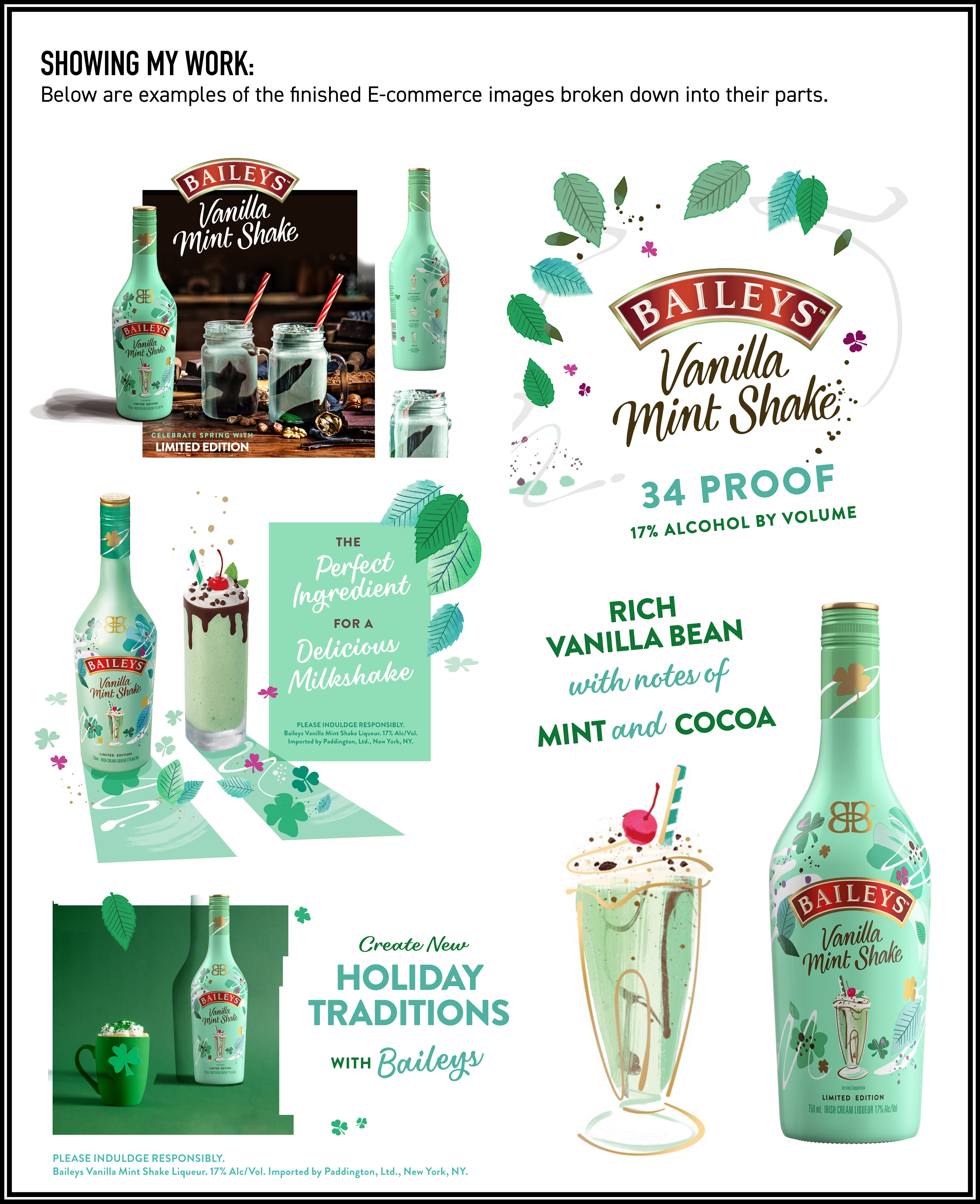
Behind the scenes:
I wanted to show some behind the scenes stuff here, break it down a little bit!
The top-left and bottom-left images were stock photo backgrounds that needed the bottle added to them, and the milkshakes needed to be recolored mint green, and a Bailey's bottle reflection added to the glassware to "ground" them both into the scene. The photo with the deep green cup and background were originally just a stock image with the cup, I added the bottle front (also shaded and gave it a drop shadow), and the typography. I designed the little halo of leaves and vanilla swirl that border the non-photo frames, and the typography (minus the logo) are mine, using the typefaces from the Style Guide.
The top-left and bottom-left images were stock photo backgrounds that needed the bottle added to them, and the milkshakes needed to be recolored mint green, and a Bailey's bottle reflection added to the glassware to "ground" them both into the scene. The photo with the deep green cup and background were originally just a stock image with the cup, I added the bottle front (also shaded and gave it a drop shadow), and the typography. I designed the little halo of leaves and vanilla swirl that border the non-photo frames, and the typography (minus the logo) are mine, using the typefaces from the Style Guide.